
REVIEW
CLAIM: “What this graph proves is that even IF mankind is influencing the temperature, it is insignificant compared to the natural forces that are apparent when you look back 400,000 years. But the temperature change over the last 150 years could mostly be due to coming out of the little ice age that lasted from 1200 to 1850. Mankind’s effect is likely a small part of this recent warming and an artifact of Urban Heat Island (UHI) effect.”
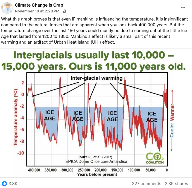
In a Facebook post from 10 November 2024, a social media user claimed that “even IF mankind is influencing the temperature, it is insignificant compared to the natural forces”. Alongside this claim, they posted a graph showing ice ages and supposed temperature anomalies over the last 400,000 years. To date, the post itself has been shared over 2,200 times. But this isn’t the first time the graph they shared has been used to ‘question’ climate change.
On 28 December 2023, known climate misinformer Steve Milloy shared the same graph on X/Twitter to question CO2’s influence on Earth’s temperatures – a well-established relationship that is unequivocally supported by scientific evidence[1-3], as we’ve extensively reviewed in the past (linked here).
To investigate the more recent claim, we will review what scientific evidence shows regarding natural forces vs. human influence on rising global temperatures.
Recent global warming is driven by increased atmospheric CO2 from human activities, not ‘post-ice age effects’
Before investigating the specifics of these claims, it is worth noting that the central claim seeks to answer a question that climate scientists solved years ago: what has driven the observed global temperature increases in recent times?
As we’ve extensively covered in the past, the answer to this question is CO2 from human activities. As explained by the Intergovernmental Panel on Climate Change (IPCC) – the world’s leading authority on climate change:
“Human activities, principally through emissions of greenhouse gases, have unequivocally caused global warming, with global surface temperature reaching 1.1°C above 1850–1900 in 2011–2020”[4]
The confidence in this conclusion arose from IPCC’s extensive review of reputable scientific literature on the subject and climate scientists’ research into both natural forcings (e.g., solar and volcanic influence) and human influence[1,4,5]. With such robust evidence supporting these conclusions, groundbreaking findings would be necessary to ‘reopen’ this case.
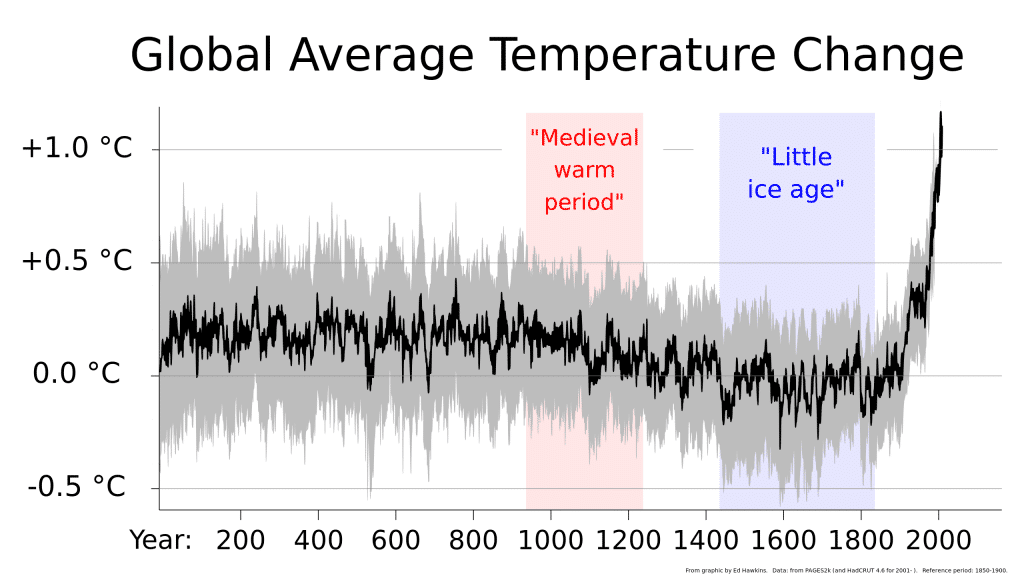
So does the recent Facebook post introduce new evidence or ideas? No. In fact, the ‘Little Ice Age’ and urban heat island (UHI) effects are common climate misinformation topics that Science Feedback has already reviewed in the past. The ‘Little Ice Age’ – which, as climate scientists explained to us, was not a real ice age – was a period of somewhat colder climate conditions that occurred between roughly the 16th to 19th centuries (Figure 1).
Figure 1 – Reconstructions and observations of global temperature change over the last two millennia. The magnitude of temperature change during the Little Ice Age, denoted by the blue-shaded region of the plot, is far outweighed by current warming. Source: Climate Lab Book
We received the following comment from David Battisti, Professor of Atmospheric Sciences, University of Washington, for a past review:
David Battisti, Professor of Atmospheric Sciences, University of Washington:
“The published peer reviewed literature concludes that the Little Ice Age was primarily due to an extended period of increased volcanic activity. A recent study quantified the cause of the cooling during the Little Ice Age (1600-1850) to be primarily due to changes in volcanic activity (77%) and secondarily due to changes in greenhouse gas concentrations (13%); changes in solar output contributed only about 10% to the net cooling of the Little Ice Age.”
In response to a claim from a past review that emerging from the Little Ice Age ‘explains 20th century global warming’, climate researcher Dr. Stefan Rahmstorf, explained the following:
Stefan Rahmstorf, Professor, Potsdam University:
“no scientific study can explain modern warming in this way. ‘Emerging from the little ice age’ is not a physical mechanism or explanation.”
Timothy Osborn, climate researcher at the University of East Anglia, offered further explanation on this point in the following comment from a past review:
Timothy Osborn, Professor, University of East Anglia, and Director of Research, Climatic Research Unit:
“[N]atural warming after the Little Ice Age was complete by the late 1800s. The warming from the late 1800s to the present is all due to human-caused climate change, because natural factors have changed little since then and even would have caused a slight cooling over the last 70 years rather than the warming we have observed”
Regarding the urban heat island effect, the IPCC explains that, “The urban heat island phenomenon is well-known and understood. For instance, temperature measurements from thermometers located in cities are corrected for this effect when global warming trends are calculated.”[1] However, even prior to corrections, the IPCC notes that the uncorrected urbanization influences contribute no more than 10% to the centennial global land averaged temperature trends.
The evidence above shows that scientists are already aware of the minimal bias from UHI effects and account for this when studying global temperature trends. Therefore, the claim from the Facebook post is inaccurate and over-exaggerates the effect of UHI on rising global temperatures.
So how have scientists determined what has actually made a difference in these trends? They assessed the relative contributions of different variables to global warming and determined how recent global warming compares to natural variability. As shown below in Figure 2, greenhouse gases overall cause the most global warming of all the climate change drivers, and CO2 causes the most global warming of all the greenhouse gases. Note in the middle graph of Figure 2 that internal variability (i.e, natural occurring variation) and natural drivers (e.g., solar and volcanic influence) are negligible relative to human influence through greenhouse gas emissions.
Figure 2 – The contributions of different drivers to global warming from the present time period (2010-2019) relative to the time period of 1850-1900. The estimates of warming (red) and cooling (blue) from radiative forcing studies (panel (c)) are based on both direct emissions into the atmosphere and their effect, if any, on other climate drivers. Source: IPCC (2021)[6]
Scientists have also investigated which physical properties control the climate system and have quantified their influence on global temperatures. By incorporating all these physical properties in global climate models, scientists have been able to simulate the climate from 1850 to the present day.
As shown in Figure 3 below, the simulation that only included natural variables (solar and volcanic) was unable to match the observed global temperature changes over the period of 1850-2020. However, the addition of human drivers – such as CO2 emissions – leads to a much closer match between simulated and observed temperatures.
These simulations also show that human greenhouse gas emissions are the only variable that can reproduce observed temperatures; other natural phenomena (i.e., solar and volcanic activity) fail to explain the recent rise in global temperatures.
Figure 3 – Observed and simulated changes in global surface temperature from 1850 to 2020. The black line represents 170 years of observed data and is compared to Coupled Model Intercomparison Project Phase 6 (CMIP6) climate model simulations. The brown area represents the temperature response to both human and natural drivers and the green area to only natural drivers (solar and volcanic activity). Solid colored lines represent the averages, and the shaded areas represent the very likely range for the models. Source: IPCC (2021)[6]
The evidence above suggests that neither UHI effects nor the ‘little ice age’ can explain recent increases in global temperatures. In fact, contrary to the central claim, human influence was not ‘insignificant’, but instead the primary driver of recent global warming.
Although we’ve addressed the Facebook post’s claims and shown that they are inaccurate, one question remains: does their graph prove anything? The graph supposedly shows temperature anomalies over the last 400,000 years and temperature anomaly ‘spikes’ following ice ages in that period.
The graph cites the following data sources: “EPICA Dome C ice core data” and Jouzel et al. (2007) – but it was unclear how they used this data. After some digging, we discovered that the original source of this graph included a link to the data file stored in the National Oceanic and Atmospheric Administration (NOAA) directory (source linked here). While this is a reputable source of data – and Earth’s past temperatures can be inferred from ice core data (see past review here) – there is a major problem with the way it’s presented in the graph.
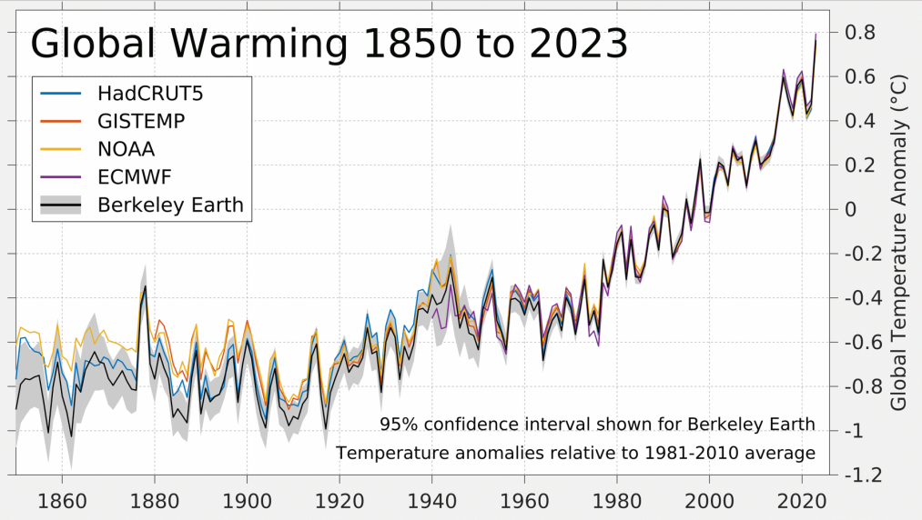
The most recent data does not start at zero years before present – as the graph suggests – but rather in the year 1912. This excludes the last 112 years of temperature anomalies that could have been plotted. Granted, this was the date range included in this study. However, it is misleading to plot the data this way without at least including a note that at the scale of this graph (i.e., 400,000 years), one cannot see that over 100 years of the most recent data is missing. This missing data excludes very important context: global temperature anomalies have steeply increased over that time period (Figure 4).
Figure 4 – Global warming estimates from 1850 to 2023 Source: Berkeley Earth
There’s also another problem with the Facebook posts’ graph. It’s annotated with a claim that “interglacials usually last 10,000 – 15,000 years. Ours is 11,000 years old”, which – given the context of the other claims – implies that the recent global temperature trends are following what is expected during an interglacial period. We already demonstrated why this is inaccurate based on evidence of what has driven recent temperature trends (i.e., increased CO2 from human activities). However, there are also studies that show temperature trends since the actual last ice age (as opposed to the ‘little ice age’ we addressed) – addressing both pieces of missing context from the Facebook post’s graph.
The Last Glacial Maximum – colloquially known as the last ice age – ended around 21,000 to 18,000 years ago. In a 2021 Nature paper titled “Globally resolved surface temperatures since the Last Glacial Maximum”, researchers concluded the following about how modern warming compares to changes since the last ice age:
“When compared with recent temperature changes[7], our reanalysis indicates that both the rate and magnitude of modern warming are unusual relative to the changes of the past 24 thousand years.”[8]
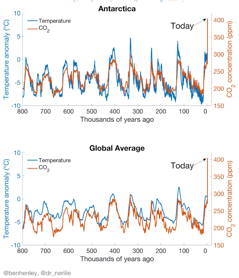
The findings from this paleoclimate show that it is inaccurate to suggest that recent temperature trends are normal in the context of Earth being in an interglacial period. On the contrary, scientists have concluded that, following the last ice age, modern warming trends are unusual in this context of the last 24,000 years[8]. However, this is not surprising given the known physical relationship between CO2 and global warming[1-3], and the way CO2 has correlated with Earth’s global temperatures in the past (Figure 5).
It turns out data from the same ice cores – alongside CO2 concentrations – was plotted by Dr. Nerilie Abram, Professor of Climate Science at The Australian National University, and Dr. Ben Henley, Research Fellow in Climate and Water Resources, University of Melbourne. This graph (Figure 5) shows that recent atmospheric CO2 concentrations exceed those that occurred in the last 800,000 years*.
Notes:
*While the ice core data plotted in Figure 5 also had the same age constraints as the data plotted on the graph from the recent Facebook post, Figure 5 also includes more recent data (i.e., recent direct CO2 measurements that have exceeded 400 parts per million). Data sources included: Parrenin et al. 2013; Snyder et al. 2016; and Bereiter et al. 2015.
Figure 5 – Graphs showing CO2 and temperature oscillations over the last 800,000 years for the global average and Antarctica (data from Parrenin et al. 2013; Snyder et al. 2016; Bereiter et al. 2015). Source: Dr. Ben Henley and Dr. Nerilie Abram, The Conversation.
Conclusion
Scientific evidence unequivocally shows that recent global warming is driven by increased atmospheric CO2 from human activities. Climate scientists explain that current global temperature trends cannot be explained by emergence from the ‘Little Ice Age’, and that urban heat island effects are negligible and already accounted for in studies. In a recent study looking at 24,000 years of paleoclimate data, climate scientists concluded that recent global temperature trends are unusual in the context of those experienced since the last ice age. The graph shared in a recent Facebook post was misleading as it showed 400,000 years of temperature data from a paleoclimate study without noting or acknowledging that the most recent 112 years of temperature data was missing. Additionally, the Facebook post’s claims about natural forces and/or urban heat island effects were inaccurate, as scientific evidence shows their effects on recent global warming are negligible relative to increased atmospheric CO2 from human activities.
REFERENCES:
- 1 – IPCC (2021). Sixth Assessment Report.
- 2 – Zhong and Haigh (2013) The greenhouse effect and carbon dioxide. Royal Meteorological Society Weather.
- 3 – Pierrehumbert (2011) Infrared radiation and planetary temperature. Physics Today.
- 4 – IPCC (2023) Climate Change 2023: Synthesis Report.
- 5 – IPCC (2018). Special report on global warming of 1.5°C.
- 6 – IPCC (2021) Summary for Policy Makers. In Climate Change 2021: The Physical Science Basis. Contribution of Working Group I to the Sixth Assessment Report of the Intergovernmental Panel on Climate Change.
- 7 – Morice et al. (2020) An updated assessment of near-surface temperature change from 1850: the HadCRUT5 dataset. Journal of Geophysical Research: Atmospheres.
- 8 – Osman et al. (2021) Globally resolved surface temperatures since the Last Glacial Maximum. Nature.


